
The front Palatino shown in the poster Pearl Harbor suggests that the film could be quite old as the end of each letter is quite sharp in a similar way to Times New Roman. Also the spelling tells us it is an American film as 'Harbor' is spelt in the American way. The font of the title makes it seem less obvious and our eyes are drawn into the airplane and the characters. This is because the front is small compared to the image. On the other hand, by having the characters image at the top, it makes us think about the title more and who the actors might be.
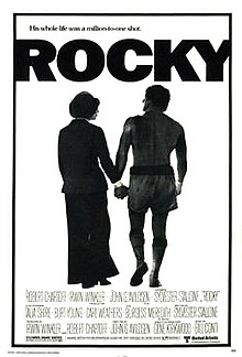
The font Franklin Gothic Heavy is used in the title Rocky on a white background which emphasises the title because it stands out. The title 'Rocky' is very bold compared to Pearl Harbour which attracts a younger audience as it is more informal. It is a Sans Serif fonts which shows it is modern.
No comments:
Post a Comment