


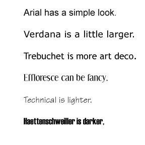
There are literally thousands of different fonts to choose from and they are basically divided into two subtypes, serif and sans-serif. Serifs are details on the end of some of the strokes. Letters that don't have these are called sans-serif.

It is generally thought that serif text is easier to read and that sans serif is better for headlines. Fonts can have really interesting names like, Trebuchet, Helvetica or Baskerville.


In this James Bond film, geometric fonts like Neutroface have roots in the early 20th Century and the architectural lettering styles of that period. Geometric fonts like this have a sense of efficiency and modernity about them which is universally appealing.

The Swiss sans serif font Helvetica was chosen for the Trainspotting poster because of its similarity to that used on a train timetable. It's also used a lot on chemical packaging, which was suitable given the drug references in the film. Helvetica is associated with modernism and minimalism. It's clean, simple and ordered.
Both of these posters use different styles of font effectively to convey different moods for their audiences. When creating the titles for our thriller opening we will have to carefully choose an appropriate font as something as seemingly insignificant as using the wrong kind of font could ruin the whole scene and mood that we'd be trying to create.
No comments:
Post a Comment